1.5: How to Control Backgrounds and Lighting in an AI Lookbook
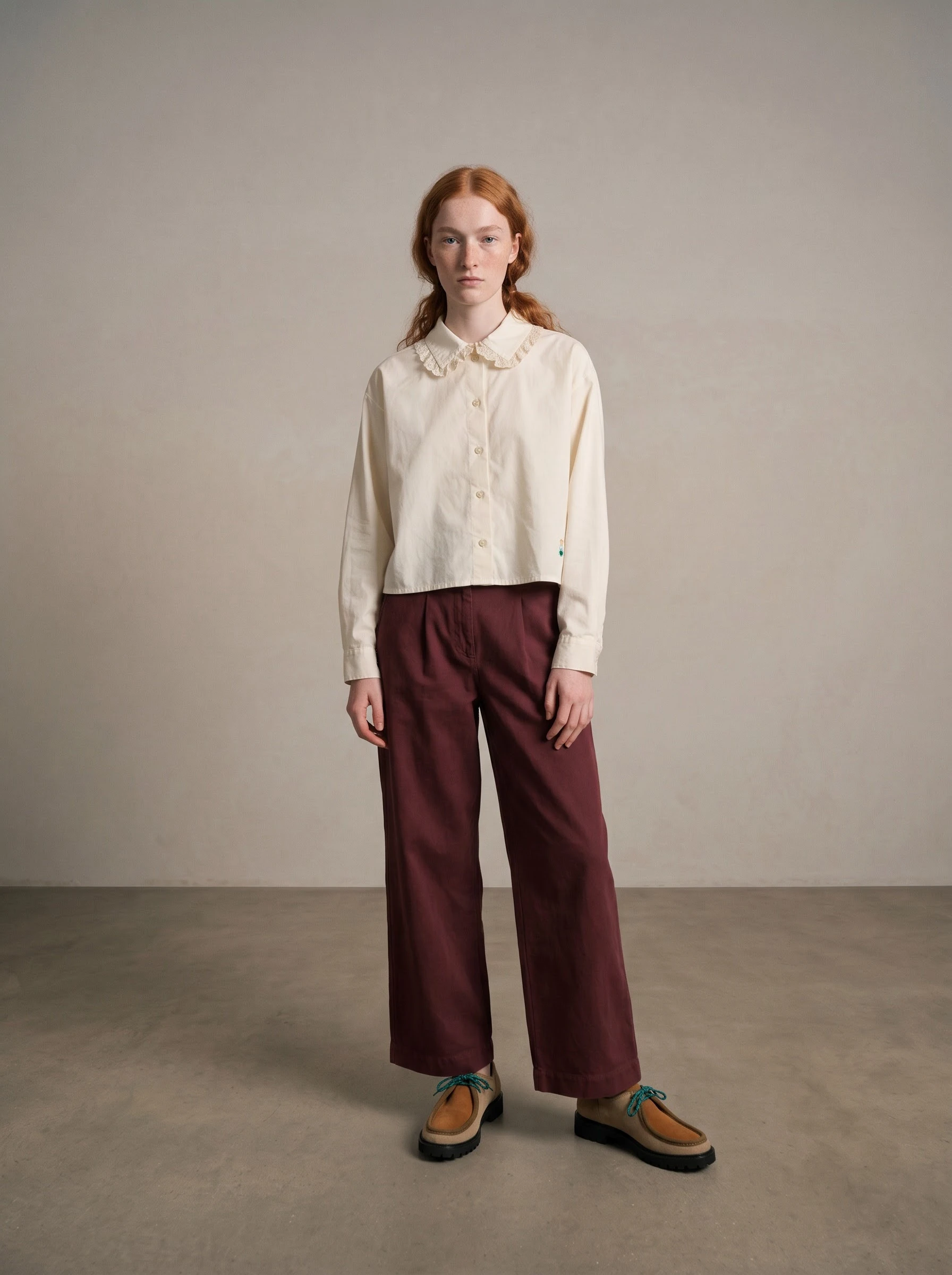
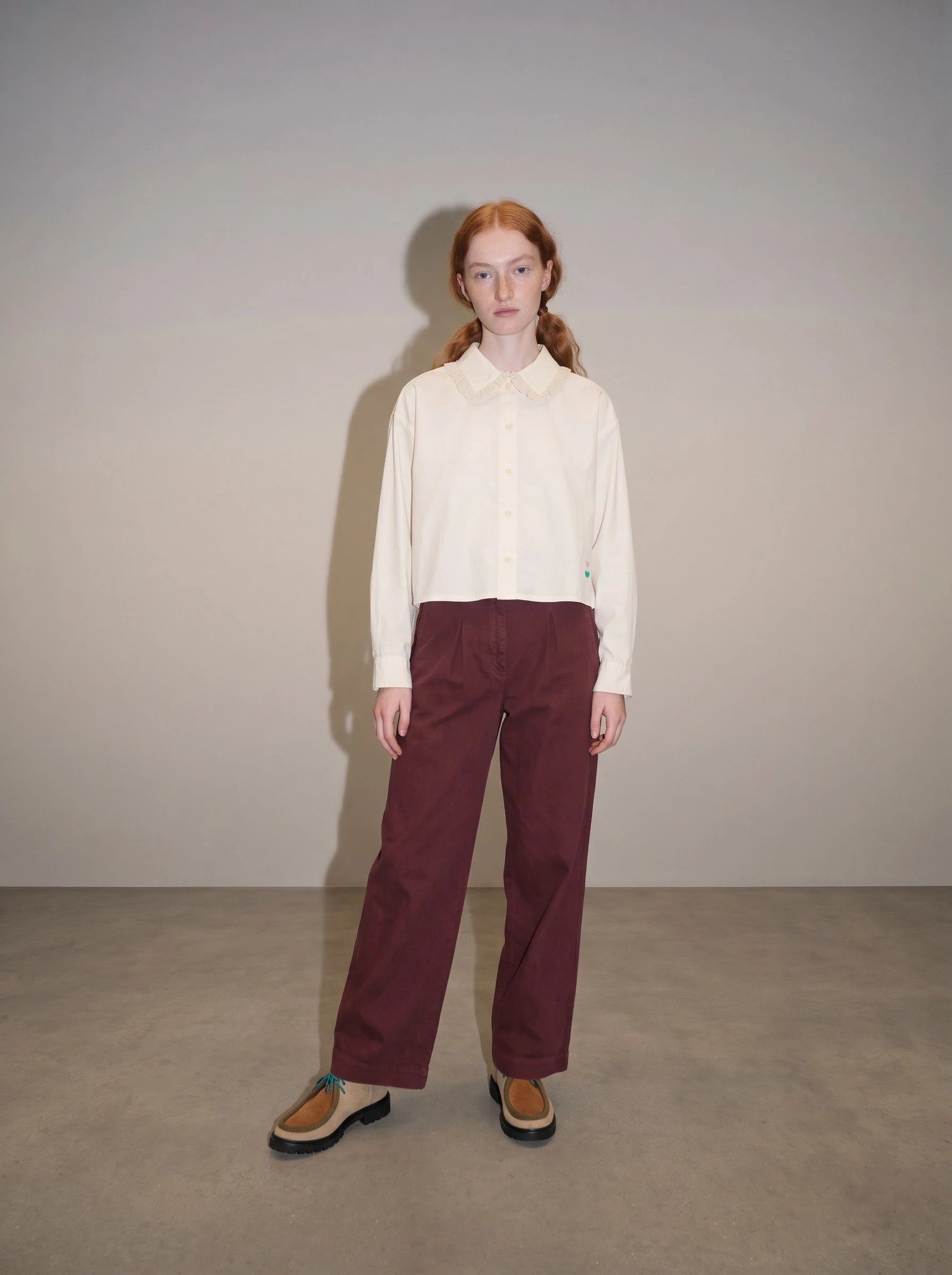 Watch lesson 1.5Astria Academy
 Astria Workshops · Series 1: Your first AI lookbook · Lesson 5
Bring the background and lighting of your first AI lookbook image closer to your brand. You’ll work through a precise color, a textured reference and lighting instructions, then compare the results with your starting image.
Follow workshop 1.5: Background & Lighting. Captures below show the actual controls in the video; comparison images use the original full-resolution files. Click an image to enlarge it.
Before you begin
Open your brand’s workspace on Astria Generate, with the outfit from your first lookbook image. Keep a brand reference photo beside the first result. Notice how the background and shadows affect the mood before changing the instructions.
Step 1: Specify a background color
Make sure Image is selected. Open the gear below the prompt and find Background color. Click the color swatch. Use the eyedropper in your browser’s color picker to sample the background in your reference image, and include the resulting HEX value in your instructions. A HEX value is a color code, such as #D8D5CF, the neutral color used in this workshop.
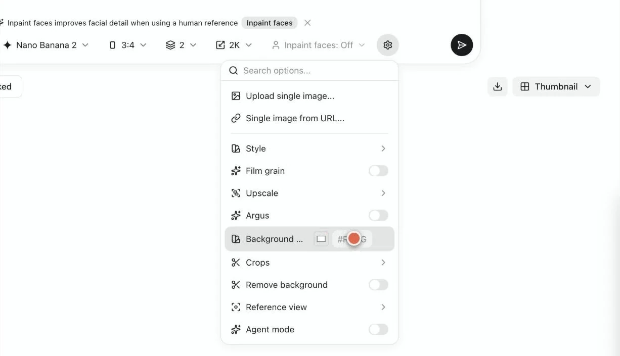
A color name alone can lead to different shades. A code makes the direction more specific, but it does not guarantee an exact match. Compare the background across the generated images; exact matching may need further editing.
Step 2: Add a reference for a textured background
For a textured setting, choose a reference image that shows the surface and surroundings you want. Add it using the plus in the Background reference square. Inspect the texture as well as the color, then compare both with the new result.
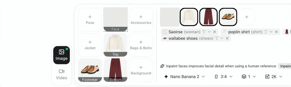
Step 3: Describe the shadows
Look at the brand’s photos and choose words that describe their light. Include that direction in the prompt. The workshop’s examples are “strong shadows,” “light shadows” and “no shadows.” Check the actual result against the reference rather than assuming the wording produced the intended effect.
Step 4: Compare diffused lighting and on-camera flash
For softer light and gentler shadows, try “diffused lighting.” For a different effect, try “on-camera flash,” meaning a flash on or near the camera. Compare how the light changes the clothes and the background.
Step 5: Compare the first and directed images
Put the first image beside the result after your background and lighting direction. Look at the background color, the light and the shadows. Decide which changes bring the image closer to the brand’s style.
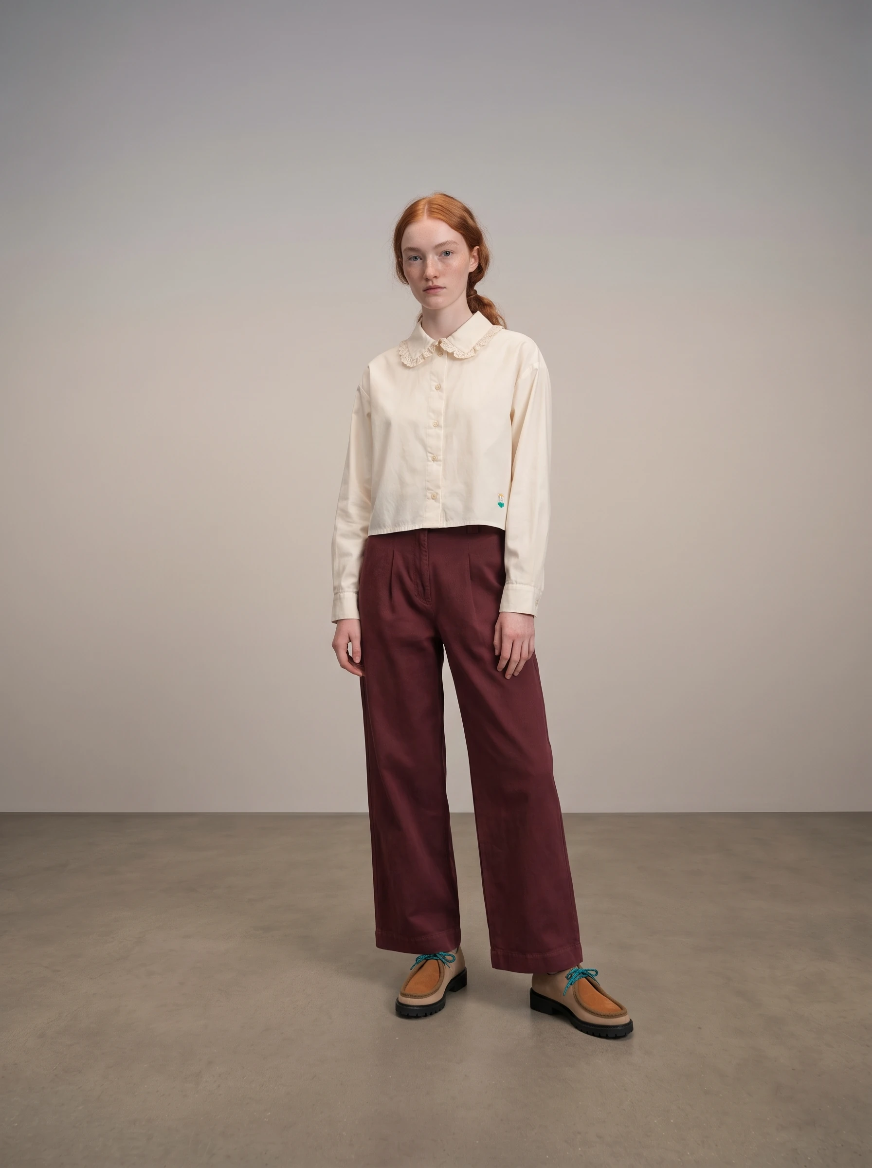
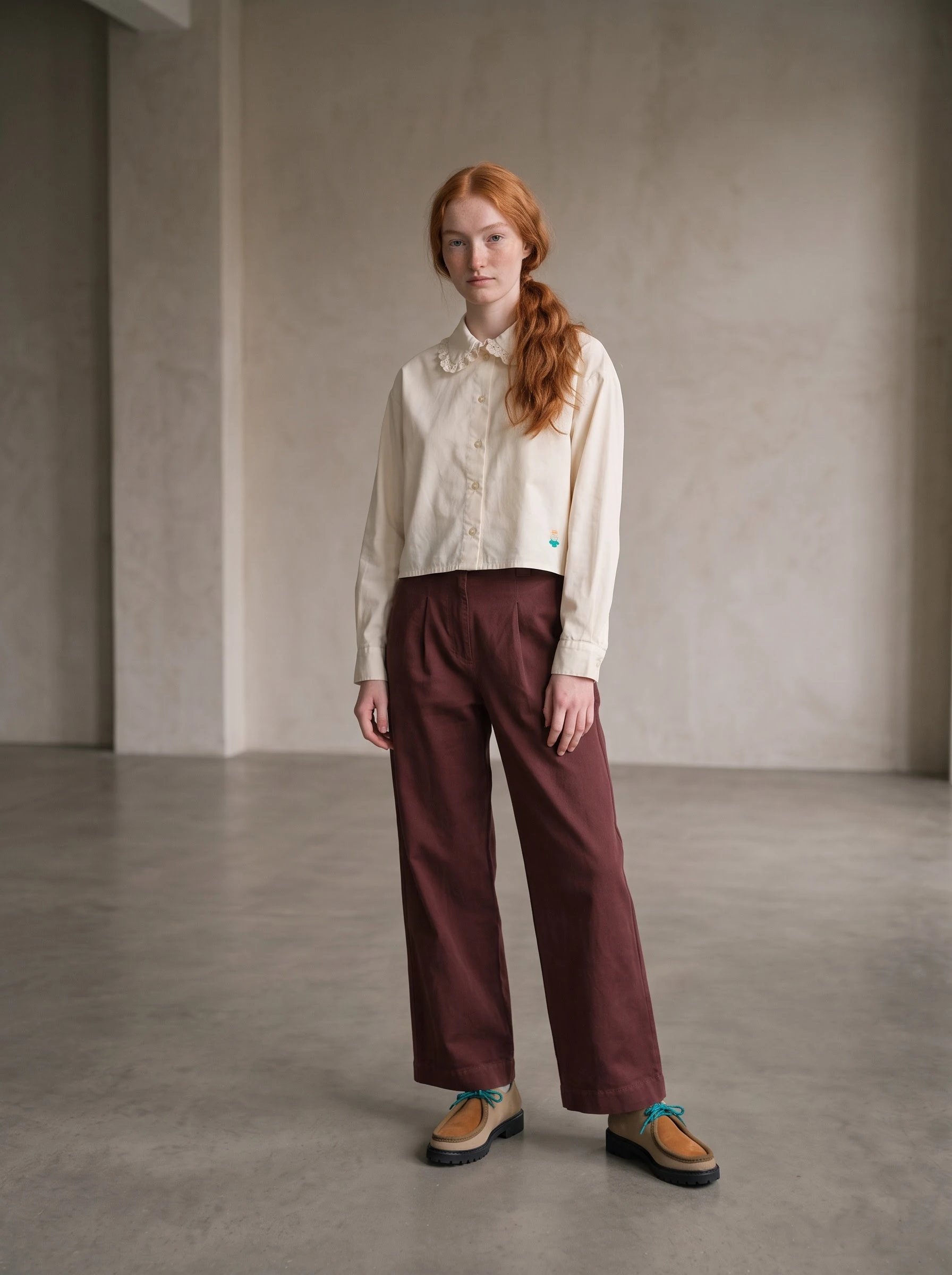
Check your result
Compare the selected image with both the brand reference and the product photos. Check the background’s color and surface, the direction and softness of shadows, and whether the garment remains accurately represented. Keep the direction that fits your brand before moving on to hair, makeup and accessories.